





Fabuwood Galaxy Pistachio Green cabinets: what the green really is, and how much of it a kitchen should hold
Reviewed September 2026 · Captivating Cabinets
Prices quoted in this article were read off the grid on the review date; the live price grid on this page governs.
Every other painted finish in this part of the catalogue asks you to choose a shade of white or gray. Galaxy Pistachio Green asks a harder question, because it is a colour, and a colour commits a room in a way a neutral never does. It also arrives with a name that promises more than the door delivers. So this guide starts by correcting the name, then deals with the thing buyers actually lose sleep over — not which green, but how much of it, and where — before it gets to partners, pairings, resale, the box underneath and how to order without guessing.
Pistachio on the label, gray-sage on the door
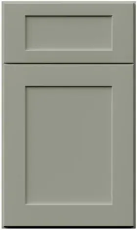
Picture a pistachio and you picture a bright, slightly yellow green, the colour of the ice cream. This door is nothing like that. Sampled from the swatch, it is a quiet gray-sage: a mid-light value with the colour pulled well down, so that at a glance across a room some people call it gray and some call it green, and both are half right. It is not mint, which is a cooler, cleaner green with blue in it. It is not olive, which leans yellow and brown. It is not a teal or a blue-green either. If you want a label that tells a designer what you have, "muted gray-sage" is the accurate one.
That matters for two reasons. The first is expectation: people who order off the name and a bright phone screen are sometimes disappointed by how restrained the real thing is, and people who were nervous about committing to green are usually relieved. The second is that a colour this far toward gray behaves partly like a neutral, which is exactly what makes it liveable across a whole kitchen and exactly why it is so easily pushed around by what surrounds it (the next section).
For reference, the nearest thing we sell to it is not another Fabuwood finish at all. Measured from the swatches, it is almost indistinguishable from Evergreen Fog, one of the stock doors in the NOMA frameless line, which puts the same gray-sage on a flat slab instead of a framed shaker. If you like the colour but want a flat, handleless modern kitchen, that is the one to look at. The green cabinet guide places both among the other greens we carry, from pale greige-greens to near-black ones.
And if what you actually wanted was the nut — a brighter, more saturated green on the same Galaxy door — that exists too, just not as a stock finish. Fabuwood’s custom colour program will spray a framed Allure door in a Sherwin-Williams or Benjamin Moore colour you name, at extra lead time. Ask us before you settle for a green that is quieter than the one in your head.
A greyed green takes its cue from whatever it stands next to
Here is the one piece of colour behaviour worth understanding before you order, and it applies to any low-saturation colour, not just this one. A strong colour holds its own identity in any company. A muted one does not: it borrows from its neighbours, and the eye reads it by contrast with what is next to it. Put this door beside something warm and it looks greener. Put it beside something cold and gray and it looks grayer. The paint has not changed. Your reading of it has.
In practice that means the finish is decided as much by the counter, the floor and the metal as by the paint itself. A few general patterns, true of greyed greens in most rooms:
- Warm white, cream and natural oak beside it bring the sage forward. This is the combination in most of the photographs that make people want a green kitchen, and it is why those photos look greener than the swatch.
- Cool gray stone, gray tile and a lot of stainless steel push it back toward gray. Surround it with them and it can end up reading as a slightly odd gray rather than as a colour at all.
- Brass and gold hardware warm it; black hardware sharpens it and makes it look more deliberate; nickel and chrome leave it cool and quiet. More on each below.
- Very warm bulbs push most grays and greyed colours toward yellow, which on a sage can tip it toward olive in the evening. Cooler daylight from a north window tends to gray it. Neither changes the paint; both change the room you see it in.
So the question is never just "do I like this green?" It is "do I like this green next to my counter, my floor and my pulls?" — which is a question the door sample can answer and a screen cannot. The matching guide sets out the order in which to lock those surfaces down once the cabinet is chosen.
How much green: four doses, from a vanity to the whole room

Most of the anxiety about a green kitchen is really anxiety about quantity. Nobody regrets a green bathroom vanity. Plenty of people wonder, a year in, whether they should have stopped at the island. So before you pick partners and pulls, decide which of these four you are buying. Each one is a legitimate kitchen, each one suits a different room, and each one is progressively harder to walk back.
Read them with one test in mind. Stand in the room and look at the wall opposite the door you use most. Whatever that wall is going to be — uppers, a tall run, the range — is what you will see every time you walk in, and it deserves the dose you are most sure of.
Dose one: a vanity, a bar or a laundry
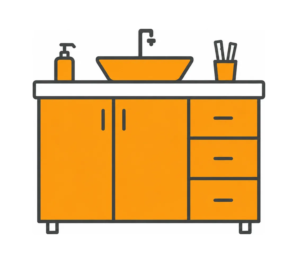
The smallest commitment, and a good way to find out whether you like living with the colour. A bathroom vanity in this sage with a white top and brass tap is about as safe as a colour decision gets; so is a coffee or wet bar in a kitchen that is otherwise white. The vanity boxes are the same build as the kitchen boxes, cut to bathroom height, on the vanity page.
Dose two: the island
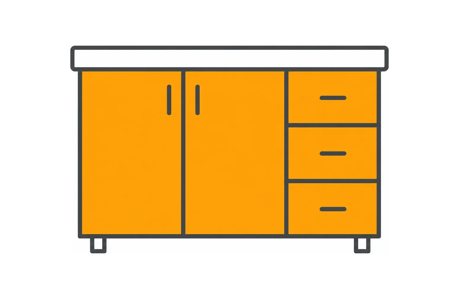
The most popular way to put colour in a kitchen, and for good reason: the island is a free-standing object, so a different colour reads as intentional rather than as a change of mind. The perimeter stays light (Frost, Dove or Linen), the green becomes the piece of furniture in the middle, and if tastes change the island is the smallest and cheapest block to replace. This is the dose we suggest to anybody who is unsure.
Dose three: every base cabinet
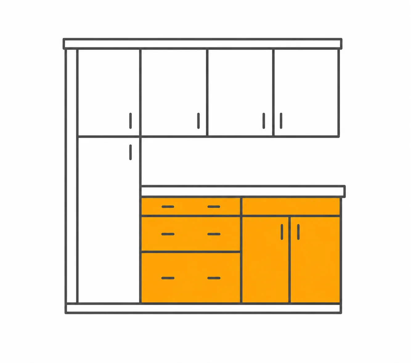
Green below the counter, a light finish above it. The colour now runs around the room, but it sits low, where it grounds the space instead of closing it in, and the upper half stays bright. It suits rooms with average light and eight-foot ceilings, and it is the dose where the countertop matters most, because the counter is now a stripe drawn along the top of the green for the whole length of every run. The base cabinet page is written around exactly that.
Dose four: the whole kitchen
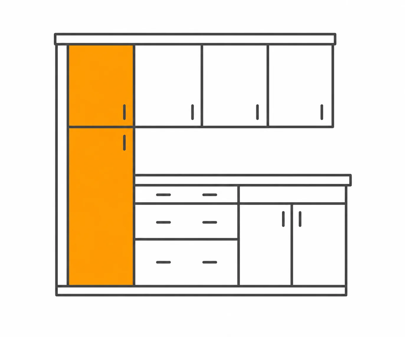
Green on everything, top to bottom. Because this is a muted, gray-leaning green, a whole room of it is calm and enveloping rather than loud — closer in feel to a painted library than to a bright colour scheme. It wants either good daylight or a room large enough that the green is not pressing in on you, plus the warm neighbours from the section above, or it can feel heavy. The wall cabinet page deals with the upper half, which is where a whole-green kitchen is won or lost.
What each dose costs, and why the colour itself costs nothing
Here are the four doses priced as real orders, at displayed prices on the review date. The purpose is not to quote your kitchen — the free design does that — but to show where the money actually sits, and one thing that surprises people: there is no premium for choosing green.
| Dose | Example order | What it comes to |
|---|---|---|
| Vanity | A 54″ vanity: GPG VSB36-34 sink base ($490.75) beside a GPG VDB18-34 drawer base ($672.75) | $1,163.50 |
| Island | A 96″ island: two GPG DB30 three-drawer bases ($845.00 each) either side of a GPG B36 ($676.00), two GPG BEP end panels ($149.50 each), one GPG TK8 toe kick ($55.90) | $2,720.90 |
| Lowers | A 144″ sink wall plus a 42″ return: GPG BLB36/39 blind corner, SB36, DB30, B15, DWR6 dishwasher panel, B24, DB18, BEP and two TK8 | $3,907.80 |
| Whole kitchen | FGPG10, the 10x10 package: six wall cabinets and four base boxes with two toe kicks | $4,400.00 ($6,769.23 struck through — the price before our 35% discount) |
Two things to take from that table. First, the lowers row comes within $500 of the whole-kitchen row, which looks backwards until you read the orders: the lowers example has three drawer banks and runs further, while the 10x10 is a benchmark built from door bases and a blind corner. A 10x10 is a yardstick for comparing quotes, not a kitchen anybody actually builds; the 10x10 guide explains how to use one.
Second, and more important: every price above is identical in Frost, Dove, Nickel, Pitch Black and the other standard Galaxy paints (Linen is quoted on request). Only the two oak finishes, Desert Oak and Natural Oak, run higher, at roughly 20% more. So the green costs you nothing extra at any dose. What it can cost you is flexibility later, and that cost rises with the dose: a green vanity is a weekend to change, a green island is one block of cabinets, a whole green kitchen is the kitchen. That is the real trade, and it is why the dose decision comes before everything else.
Brass, black or nickel; white, cream or marble; oak or walnut

Three families of material meet this green in every kitchen: the metal on the doors, the stone on the counter and the wood somewhere in the room. The table below is our honest read of each option against a muted gray-sage — which ones make the green look like a choice, and which ones make it disappear.
| Material | What it does to the green | Our read |
|---|---|---|
| Brass or gold hardware | Warms it and pulls the sage forward; the pairing most people picture | The classic, and the safest way to make it read as green |
| Matte black hardware | Draws every pull as a crisp dark line; the green looks more graphic and modern | Excellent, especially on slim bar pulls |
| Brushed nickel or chrome | Keeps it cool and quiet; the door leans toward gray | Fine in a calm room; choose it only if you want the colour understated |
| White quartz | Clean, high-contrast stripe along the top of the green | Reliable; the brightest version of the kitchen |
| Warm white or cream quartz | Softer contrast; the sage reads warmer and greener | Our favourite with this finish |
| Veined marble or marble-look | Adds movement; gray veins bring out the gray, warm veins the green | Choose the vein colour on purpose |
| Butcher block or oak top | Warmest possible neighbour; a very natural, relaxed kitchen | Lovely on an island; on a whole perimeter, check it against the floor |
| Cool gray stone or concrete-look | Drains the colour out; the door drifts toward gray | The pairing we talk people out of |
| Light oak floor | Warm ground under the green, the most flattering floor there is | Yes |
| Walnut or mid-brown wood | Richer, darker contrast; the room gets heavier and more traditional | Yes, as a floor, a shelf or an island top |
The one rule worth keeping: one metal, used everywhere, including the tap and the light fittings. Brass on the drawers, black on the tap and nickel on the pendants is the fastest way to make a green kitchen look accidental. Beyond that, the backsplash follows the counter — cream zellige, white subway or a full-height slab of the counter stone are the usual answers — and the wall paint should be a warm white rather than a gray, for the reasons in the neighbours section. The green cabinet guide has a fuller pairing table across every green band.
Two-tone with the other Galaxy finishes
Because every Galaxy finish shares the same door, box and code system, you can split a kitchen between two of them and the doors line up rail for rail. That is the practical advantage of staying in one line. The question is which partner, and what job each colour does. Here is how the sage behaves next to the finishes people most often ask about.
| Partner | Where it usually goes | How the pair reads | Verdict |
|---|---|---|---|
| Frost | Uppers or perimeter, green below or on the island | The brightest pairing; crisp and fresh, the green looks most like a colour | Best partner in a darker room |
| Dove | Uppers or perimeter | Softer than Frost; off-white and sage read as related, never stark | Our most-recommended partner |
| Linen | Perimeter, green island | Warm and tonal; beige pushes the sage greener. Needs good light, or both go muddy together | Good in a bright room |
| Nickel | Island or tall run | Two muted mid-tones of similar depth; can look like a near-miss rather than a choice | Usually avoid |
| Timber | Island, hood, open shelves, tall run | Warm honey wood against sage; relaxed, natural, a little rustic | Excellent in small doses |
| Natural Oak | Island or tall wall | Pale grained oak with the green; the most current-looking pairing in the line | Excellent, at about 20% more for the oak boxes |
| Pitch Black | A small island or a bar | Strong contrast; black makes the sage look paler and more gray | Works, but keep the black to one object |
The pattern behind the table: this green pairs best with something clearly lighter (a white) or clearly different in kind (a wood). It pairs worst with another muted mid-tone of about the same depth, where the eye cannot tell whether the difference was intended. When in doubt, order both samples and hold them side by side at the heights they will actually hang. The split itself belongs at the countertop, or around the whole island — never halfway up a wall.
Will a green kitchen date, or hurt resale? The straight answer
Any colour can date. The honest question is how quickly, and how much it matters to the next buyer. Here is what we can say without hype.
Muted, grayed greens have lasted better than most colour trends, because they behave more like neutrals than like a statement. A bright kelly green or a saturated emerald marks a room to a year; a quiet gray-sage mostly marks it as "not white", which is a smaller signal. What dates a green kitchen fastest is usually not the cabinet paint but the styling that came with it: the same green on the walls, gold on every surface, a botanical wallpaper, a trend backsplash. Keep the surroundings classic — white or cream stone, a wood floor, one metal — and the cabinets have a much longer life.
On resale, a colour narrows your audience slightly and a white never does. That is simply true, and anybody who tells you otherwise is selling something. Most buyers are not put off by a well-built kitchen in a calm colour; a few will mentally price in repainting it. If you expect to sell inside two or three years, or you are doing a flip or a rental, a white or light neutral perimeter with at most a green island is the rational choice, and the flipper’s guide makes that argument at length. If you are staying five years or more, buy the kitchen you want to live in. That is what the colour is for.
- Selling soon: white perimeter, green island at most. The island is the one block a new owner could change cheaply.
- Staying a while: green lowers under light uppers, or a whole-green kitchen if the room has the light for it.
- Not sure: start with dose two. You can always add colour later; taking it away is the expensive direction.
For what is actually being specified this year, as opposed to what is being photographed, the 2026 style guide is the dealer-side read.
Under the paint: the same build as every standard Galaxy finish
Nothing about the cabinet changes when you choose green. The door is the Galaxy five-piece shaker: a solid wood frame around a ⅜″ MDF centre panel, which is there so the paint does not crack along the joint as the wood moves with the seasons. Behind it sits the Allure box — ½″ veneered plywood, a solid wood face frame and ¾″ plywood shelves, assembled with dowels, glue and pocket screws.
Drawers are ⅝″ solid wood boxes with dovetail joints, running on Tandem plus Blumotion full-extension concealed runners, so they come all the way out and close themselves. Hinges are Blum, with Quick-Release and Blumotion soft close. Everything arrives pre-assembled, doors hung and drawers fitted, and the Galaxy line typically ships in about 2 weeks, like the rest of Allure. Put the drawers through your hands before you buy; the Allure series guide compares this door with the five other Allure styles on the same box.
One detail matters more on a colour than on a white. The interior of a standard cabinet is a natural wood veneer, not paint, so opening a green door shows warm wood inside. That is a pleasant contrast, and it means a glass-front upper reads warm when lit. The exceptions are the matching-interior boxes — the no-door uppers and open-shelf cabinets — which are finished inside in the same green, so an open bay reads as colour rather than wood.
Every code starts GPG, for Galaxy Pistachio Green; the rest of the code is identical across the Galaxy paints, so GPG W3030 is the same 30″ × 30″ wall box as its white and gray cousins at the same price. Switch finish late in the process and the quote is re-prefixed, not redrawn. If the codes are new to you, the SKU decoder walks through them.
Ordering a colour: sample first, then the drawing, then the codes
Buying a neutral, you can get away with ordering from a photograph. Buying a colour, you cannot. This is the sequence we recommend, in this order.
- Order a door sample — $35.00 at the displayed price, and final sale. Get samples of your counter and floor as well.
- Stand the door upright where the cabinets will go, with the counter sample on top of it and the floor sample at its foot. Look at it in the morning, in the late afternoon and after dark under the lights you will keep. You are judging the green next to its neighbours, not on its own.
- If a two-tone room is on the table, order the partner finish too and hold the two at their real heights — one at knee level, one at eye level.
- Send us the room. The free 3D design is drawn by a designer who replies within one business day; the full design and itemised quote follow within 24 to 48 hours, with the colour rendered so you can see the dose before you pay for it. Contractors and designers buy through Captivating Pro at 20% to 40% off, one program with no tiers and no logins.
- Add the touch-up kit (GPG TOUCH UP KIT, $62.40) to the order rather than eighteen months later, and open every carton before the driver leaves.
Prefer to talk it through? Call us at (609) 900-3358. We’re builders who sell cabinets, and the dose question is one we answer most days. Everything in the finish — base, wall and tall cabinets, hoods, glass doors, accessories and trim — is on the collection pages linked here.
Common questions
- Is Fabuwood Pistachio Green actually a pistachio colour?
- No. It is a muted gray-sage: a mid-light green with the colour pulled well toward gray, nothing like the bright yellow-green of the nut. From the swatch it measures almost identically to NOMA Evergreen Fog. If you want a brighter green on the same door, Fabuwood’s custom colour program can paint Galaxy in a named Sherwin-Williams or Benjamin Moore colour.
- Will green kitchen cabinets go out of style?
- Muted, grayed greens have aged far better than saturated ones because they behave like neutrals. What dates a green kitchen fastest is the styling around it — matching green walls, gold on everything, trend tile. Keep the counter, floor and hardware classic and the cabinets last much longer.
- Do green cabinets hurt resale value?
- A colour narrows the pool of buyers slightly; a white never does. Most buyers are not put off by a calm, well-built green kitchen, but some will mentally price in repainting. If you are selling within two or three years, keep the perimeter light and limit green to the island.
- What hardware looks best on sage green cabinets?
- Brass or gold is the classic and makes the sage read warmest and greenest. Matte black is equally good and more modern. Brushed nickel and chrome work but keep the green quiet and gray-leaning. Pick one metal and use it everywhere, including the tap.
- What countertop goes with gray-green cabinets?
- Warm white or cream quartz is our favourite, because it brings the green forward. Bright white quartz is the crisp alternative, marble works if you choose the vein colour on purpose, and butcher block is lovely on an island. Cool gray stone is the one to avoid: it drains the colour out.
- What colour goes with green cabinets in a two-tone kitchen?
- A clear white (Frost or the softer Dove) or a wood (Timber or Natural Oak). The pairing to avoid is another muted mid-tone of similar depth, such as a mid gray, which reads as a near-miss rather than a choice.
- Do green cabinets cost more than white ones?
- Not in this line. Every Galaxy paint, green and white alike, carries identical prices; only the two oak finishes run about 20% higher. The 10x10 package displays at $4,400.00 against the $6,769.23 struck through beside it.
- Is the inside of the cabinet green too?
- In a standard doored box, no: the interior is a natural wood veneer. The matching-interior boxes — the no-door and open-shelf uppers — are finished inside in the same green, so an open bay reads as colour.
Keep reading
The guides behind the numbers on this page.
- Green Kitchen Cabinets: Sage, Pistachio, and Moss Shades and Pairings
Every green we sell laid out light to dark, with this one placed among the gray-sages.
- Fabuwood Cabinet Colors: The 2026 Guide to Every Finish
The fifteen Galaxy finishes side by side, so you can pick the partner colour in one sitting.
- How to Match Cabinets, Countertops, Backsplash and Flooring
The sequence for choosing the other surfaces once the cabinet colour is fixed.
- Kitchen Cabinet Samples: How to Order and Evaluate
A colour is only real in your own room; this is the routine for testing one properly.
- Cabinets for House Flippers
The resale view from people who sell kitchens for a living, useful before you commit to colour.
- Brown Kitchen Cabinets: Stains, Shades and Pairings
The wood tones a green island or tall wall gets paired with, explained from the wood side.


