




Fabuwood Galaxy Nickel cabinets: buying gray without the undertone gamble
Reviewed September 2026 · Captivating Cabinets
Nobody picks gray cabinets by accident, and almost nobody picks them calmly. By the time a shopper reaches this page the colour is usually decided and the doubt has arrived instead: will it come out greige, will it look blue in the evening, will it date the way the last gray kitchen did, will a whole run of it make the room feel like a car park. Fabuwood’s answer to all of that is a mid-tone gray the company describes as balanced, neutral and forgiving, without drifting blue or brown — the depth most people mean when they say "gray cabinets". This page takes the doubts in the order they turn up, and prices the kitchen at the end.
Which gray is this one? The ladder from Stone to Cobblestone
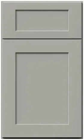
"Gray" covers about four different buying decisions, and the one that matters first is depth. We sell three of them, and they behave nothing alike in a room. Read the ladder below before you read anything else on this page, because most of the regret we hear about gray kitchens is a depth mistake rather than a colour mistake — somebody wanted a light, airy room and ordered a charcoal, or wanted a grounded, quiet room and ordered a pale gray that photographs as dirty white.
| Finish | Depth | What it does to a room | Line |
|---|---|---|---|
| Stone | The lightest | Behaves like a white that has been taken down a notch. Most versatile, least committed. | Fusion |
| Nickel | Mid-tone | The classic. Reads unmistakably as a gray kitchen without darkening the room. This page. | Galaxy |
| Cobblestone | Deepest | Charcoal-leaning. Grounds a room, needs light to come back at it, none of the drama of black. | Galaxy |
| Horizon | Not a gray | A soft blue-gray — quieter sibling to Indigo. Named here only so you can rule it out. | Galaxy |
Once depth is settled, the second question is the one that keeps people up: what does the paint do at the edges? This is where gray buyers get burned, because most grays lean somewhere. Some go green in daylight. Some go blue under LEDs. Some slide toward beige and end up as the colour nobody asked for and everybody calls greige. The whole pitch for this particular mid-tone is that it does not do any of that: Fabuwood describes it as neutral and non-drifting, which in practice means the paint stays out of the argument and lets the counter, the floor and the light do the talking. That is a duller claim than a designer colour makes, and it is exactly why it sells.
The practical consequence is that you do not have to match an undertone. A warm oak floor will not turn it green; a cool quartz will not turn it blue; a cream wall will not make it look dirty. You are choosing a depth, not a temperature. If you want the whole ladder laid out with the near-blacks and the pale grays included, the gray shade guide walks it end to end, and the Fabuwood colour guide sets all eleven Galaxy paints beside one another.
Are gray kitchen cabinets out of style? The honest version

Yes and no, and the distinction is worth more than the reassurance. What went out of style was a specific kitchen, not a colour: the 2015-to-2018 gray-on-gray room, where the cabinets, the quartz, the backsplash, the floor tile, the wall paint and the barstools were all versions of the same cool gray, with brushed nickel on everything. That room dated hard, and it dated for the reason every monochrome room dates — there was nothing in it to contrast against, so the only thing you could read was the trend that produced it.
What did not date is a mid-tone gray used as a neutral. A gray perimeter with a wood floor, white stone and brass pulls does not read as 2016; it reads the way a navy or a deep green reads, as a considered colour against warm materials. The paint was never the problem. The problem was using it six times in one room.
- Dated: gray cabinets under gray quartz, with a gray tile backsplash and gray-washed flooring. Dated: cool gray walls chosen to "match" the cabinets. Dated: every metal in the room the same brushed nickel.
- Did not date: gray below, white or wood above. Did not date: gray cabinets, white stone, a warm wood floor. Did not date: gray with brass, or gray with matte black, where the hardware is the contrast.
- Still the safest colour in a rental, a flip or a house you plan to sell inside five years. A mid-tone neutral reads as "recently renovated" to a buyer and is far less polarising than green, navy or black — the argument is made at length in cabinets for house flippers and cabinets for property managers.
If you want the trend read rather than the dealer read, the 2026 cabinet style guide tracks what is actually being specified this year. The short version: white is still the volume colour, wood tones are climbing, and gray has settled into the role it should always have had — a neutral you build a room on, rather than a look you build a room around.
What it hides, and the two things it shows more than white
This is the argument nobody makes for you in a showroom, and it is the strongest practical reason to buy this finish rather than a white one. A mid-tone gray sits far enough from both ends of the scale that most of what a kitchen throws at a door lands in its middle range and simply disappears. Not all of it, though — and the exceptions are real enough that you should know them before the order goes in rather than after.
| What lands on the door | On a bright white | On this gray |
|---|---|---|
| Fingerprints around the pull | Visible within a day, especially in raking light | Effectively gone — the oil is darker than white and lighter than gray |
| Cooking splash within two feet of the range | Shows as a yellowing film before you notice it happening | Hides it, which is a mixed blessing: clean the run on a schedule, not on sight |
| Shoe scuffs and vacuum marks at toe-kick height | The first thing a guest sees on a white run | Reads as nothing until you kneel down |
| Handprints at a three-year-old’s height | A permanent feature of family kitchens | The single best reason people in this house give for choosing it |
| Dust on the top rail, crown and light rail | Almost invisible | Shows sooner. Grey dust on white hides; grey dust on grey still catches light differently |
| Dried water spots beside the sink and dishwasher | Hard to see | Shows clearly, especially on hard water and especially on a door below a dark counter |
So the trade is honest and narrow: you give up a small amount of visible dust and water spotting in two places, and in exchange the ninety per cent of door area that people actually touch stops telling on you. If your water is hard, put a towel habit on the sink base doors and the trade is free. Nothing about the cleaning routine changes for a gray — mild dish soap on a soft cloth, dry after, and no ammonia, bleach, solvent or melamine eraser on a painted door in any colour, which the cabinet care guide covers in more detail than anyone wants until the day they need it.
Bulb temperature: 2700K is the one thing that can dull it
Every finish has a lighting condition it does not enjoy, and for a mid-tone gray it is very warm light. Under 2700K bulbs — the deep amber "cosy" LED most people default to in a living room — a gray at this depth picks up the warmth and can look faintly brown, or just dull, as though somebody left a coat of dust on it. That is not the paint drifting; it is the room being lit in a colour temperature that flattens gray. Move the same kitchen to 3000K and it snaps back. At 3500K to 4000K it is crisp and cleanly neutral, which is the look most people have in their heads when they choose it.
This is the reverse of the advice we give buyers of the warmer paints in this line, where warm bulbs are the friend and cool ones are the risk. Take it seriously enough to check the boxes before installation day, because the difference between a kitchen you love and a kitchen you are vaguely disappointed by can be four dollars of bulbs.
- Ceiling cans: 3000K is the safe default, 3500K if the room has one window or faces north. Below 3000K the run starts to lose its crispness.
- Under-cabinet LED: this is the light that actually falls on the base run and the counter, and it is the one people get wrong. Match it to the ceiling within 500K. A 2700K strip under 4000K cans makes the lower cabinets look like a different colour from the uppers.
- Daylight: north-facing rooms keep it cool and clean; south-facing rooms warm it slightly through the afternoon and then it goes back. Neither is a problem, and neither is a reason to change finish.
- Screens: no gray survives a photograph honestly. Camera white balance will push this one blue or brown depending on the room it was shot in, which is why every image on this site is a guide and a door sample at $25.00 is not.
Judge the sample in the actual kitchen at two times of day — once in morning daylight, once after dark with the lights you will keep — and prop it vertically against the wall rather than laying it flat on a counter. Flat on a horizontal surface it catches the ceiling and reads lighter than it ever will on a cabinet. The sample evaluation guide sets out the full routine.
Counters, floors, hardware, backsplash: the latitude is the point
The store’s own line about this finish is that it is the safest pick if the rest of your palette is not decided yet, and that is not marketing softness — it is a structural property of a neutral mid-tone. A colour with an undertone narrows your options the moment you choose it, because everything afterwards has to agree with it. This one does not, so you can order cabinets now and settle the counter, the floor and the backsplash later without the decision unravelling.
Counters
White quartz is the high-contrast standard and the most-photographed pairing there is: the counter draws a bright horizontal line across the middle of the room and the gray reads as deliberate below it. Soft grey veining on a white field works equally well. What to avoid is a mid-gray slab at roughly the same depth as the doors — that is the gray-on-gray mistake in miniature, and it makes both surfaces look like a manufacturing error. A warm cream or light beige quartz also works and softens the whole room; a black or deep charcoal counter is dramatic but it is the combination that makes water spots on the doors most visible.
Floors
A warm wood floor is the single element that keeps a gray kitchen from going cold, and if you take one recommendation from this page take that one. Mid-brown oak, white oak with a natural finish, a warm-toned LVP — any of them puts enough warmth under the room to stop the gray reading as clinical. Gray-washed or cool-toned flooring is the other half of the dated gray-on-gray kitchen; it is the pairing we talk people out of most often.
Hardware
This is where the latitude is most obvious and most useful. Brushed nickel, polished chrome, matte black and brass all work on a mid-tone gray, and they work for different reasons: nickel and chrome disappear into it, black draws every pull as a graphic line, brass warms the room and is the choice that most reliably reads as current rather than of-its-moment. There is no wrong answer here, which is not something we can say about a beige or a deep green. Pick one metal and use it on everything including the tap.
Backsplash
White subway, zellige, a full-height slab of the counter material, or a warm handmade tile — all fine. The one to think twice about is a grey tile, for the same reason as a grey counter. If you want texture rather than colour, go up: a full-height run of the same white stone behind the range is the detail that makes the whole room look more expensive than it was.
Two-tone in both directions, which is rarer than it sounds

Most finishes are good at one half of a two-tone kitchen. A white can only ever be the light half. A charcoal can only ever be the dark half. A mid-tone gray is the unusual one that works at both ends of the same relationship, and if you are planning a two-tone room this is the reason to shortlist it.
Whichever direction you go, order both finishes as samples and stand them up next to each other on the actual wall. The 27 kitchen cabinet ideas piece has built rooms in most of these combinations if you want to see the relationship at full size before committing to it.
Gray below, white above
The classic and the safest. The base run carries the colour and takes the wear; the uppers in Frost or Dove keep the top half of the room light so the kitchen never feels heavy. The split line is the countertop, which means it is drawn for you and you cannot get it wrong. This is the version to choose in a room with an eight-foot ceiling, one window, or a footprint under about 150 square feet — anywhere the room cannot afford dark mass overhead.
Gray as the light half, under a black or blue island
Less common, better-looking, and the thing almost nobody plans. Run the mid-tone gray on every perimeter cabinet, top and bottom, and make the island Pitch Black or Indigo. The gray is now the quiet background and the island is the object in the room. It works because the two colours are far enough apart to read as intentional but close enough in temperature that nothing clashes — the failure mode of two-tone is always two colours that look like a compromise, and this pairing never does. Bridge them with one counter material across both runs and one metal throughout.
Gray with wood, which is neither half
The third version: gray boxes, a Timber island or a Timber-fronted range hood, and the wood doing the warming instead of the floor. Useful in a room where the flooring is already fixed and already cool. Keep the wood to one element — an island, a hood, an open shelf — rather than distributing it, or the room starts to look like a showroom display of every finish we sell.
What a Galaxy Nickel 10x10 really costs once you fix the three things everyone fixes
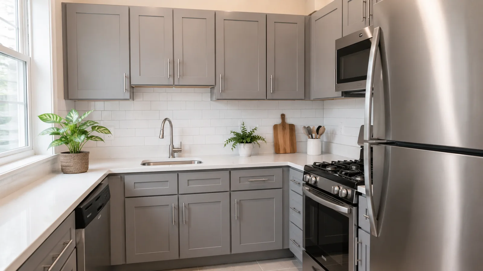
The package sells as one line, FGNK10, showing $3,500.00 with Fabuwood’s $5,384.62 list price struck through beside it. Inside that number are seven wall cabinets (a 30″ diagonal corner wall and a 12″ box over the range among them), a double-door base with two drawers, a sink base, a blind corner base, a single-door base with a drawer, a dishwasher end panel, two toe kicks and six finished ends.
That list is honest but it is not what anybody buys. Three upgrades get made to almost every 10x10 that leaves here, and a package price that ignores them is not useful to you. So here is the same package priced against the three, using the displayed grid prices on the review date. Every figure below is a live product on this site — the blind corner and the door bases come out, the replacements go in, and the difference is the real number.
| Upgrade | Comes out | Goes in | Change |
|---|---|---|---|
| A lazy Susan in the blind corner | GN BLB36/39 — $614.25 | GN LSB36 — $1,095.25 | +$481.00 |
| The cheaper corner fix: an easy-reach box | GN BLB36/39 — $614.25 | GN ERB36 — $848.25 | +$234.00 |
| A drawer bank in place of the 30″ door base | GN B30 — $555.75 | GN DB30 — $845.00 | +$289.25 |
| A drawer bank in place of the 18″ door base | GN B18 — $409.50 | GN DB18 — $646.75 | +$237.25 |
| A roll-out behind the sink base doors | Nothing | GNK ROD-B36 BLUM E — $240.50 | +$240.50 |
| Going the other way: delete a drawer for a full-height door | GN B30 — $555.75 | GN B30FD — $461.50 | −$94.25 |
Take the lazy Susan, both drawer banks and one sink-base roll-out and the package moves from $3,500.00 to $4,748.00. Add a length of crown (GN CM-1, $117.00) and a length of light rail (GN LRM, $149.50), which no 10x10 anywhere includes, and you are at $5,014.50 — still under the $5,384.62 list the package is discounted from. That is the realistic number for a kitchen this size in this finish, and it is the number worth quoting to yourself rather than the headline.
What is still not in it, and is not in anybody’s 10x10: countertops, sink, tap, appliances, pulls, delivery and installation. Also absent, and worth costing separately if you want them — a trash pull-out (GNK TC18 BLUM, $734.50), a range hood, and any glass doors on the uppers. The 10x10 pricing guide explains where the convention came from and how to use it to compare two quotes fairly.
Every box in that package, upgraded or not, is the same build: ¾″ solid wood stiles and rails 2½″ wide around a ⅜″ recessed MDF centre panel, a ½″ select solid wood carcass with a natural wood-veneer interior, ⅝″ solid wood dovetail drawer boxes on Tandem plus Blumotion full-extension runners, Blum Compact Clip hinges with six-way adjustment and soft close, ¾″ adjustable shelves and 18″-deep base shelves. KCMA certified, AWI Premium Grade, Fabuwood limited lifetime warranty, factory-assembled, 7 days to 3 weeks. The paint is the only variable; the Fabuwood review takes the construction apart from the dealer side.
Reading a quote: the prefix tells you the paint, the suffix tells you the cabinet
Cabinet codes look like a private language and are actually two ideas stacked. Get the split clear and you can audit any quote in this line without a price book. Part one is the prefix, which is the least interesting part of the code and the part everyone stares at. Part two is the suffix, which is where the money and the mistakes are.
Start with the prefix, because it answers a question people do not know they are asking: how much of my quote changes if I change my mind about the colour? Almost none of it.
- GN — G for the Galaxy door profile, N for this paint. Frost is GF, Dove is GD, Linen is GL. Everything after those two letters is identical across all of them, which means GN W3030 and GD W3030 are the same 30″ × 30″ box at the same displayed price in different colour. Switch finish late and the quote does not get redrawn, only re-prefixed.
- GNK — the prefix on things that are not painted boxes: roll-out trays, lazy Susan inserts, glass door inserts, range hoods and the 272 loose parts (adjustable shelves keyed to each box as AS-B18 at $48.75 or AS-B30 at $78.00, Blum restrictor clips, edge banding at $7.15, and a touch-up kit at $62.40 that you should add to every order).
- Vanity boxes keep the GN prefix with a VB family code — GN VB12-34 and GN VB12FD on the vanity page — because they are the same cabinet cut to bathroom height.
- Trim and panels keep the prefix too: GN TK8 toe kick, GN BEP base end panel, GN DWR6 dishwasher panel, GN CM-1 crown, GN BF3 filler. If the code starts GN it is painted to match; if it starts GNK it is a part or an insert.
Now the suffixes, which is where quotes get misread. The digits in the middle are just dimensions — width first on bases and tall boxes, width then height on wall cabinets, and a blind corner writes both numbers (GN BLB36/39 is a 36″ box that needs 39″ of wall so its door can clear the adjacent run). The letters hanging off the end are modifiers, and each one changes what arrives without changing where it goes.
| Suffix | What it changes | Seen on | What it does to the price |
|---|---|---|---|
| -FD | Deletes the top drawer and runs one full-height door instead | GN B30FD, GN B36FD | Down: $461.50 against $555.75 for GN B30 |
| -12D | Makes a 24″-deep base 12″ deep — for a seating side or a tight aisle | GN B30FD-12D, GN B36FD-12D | Down a little: $442.00 |
| -2 / -4 | Sets the drawer count on a drawer bank; three drawers is the unmarked default | GN DB30-2, GN DB18-4 | $835.25 for the two-drawer 30″ against $845.00 for the three; $799.50 for the four-drawer 18″ against $646.75 |
| SDF | One drawer front across the full width instead of two | GN B36SDF, GN SB33SDF | No change: $676.00, exactly the same as GN B36 |
| L / R | Hands the part left or right — you order one, not a pair | GN BTL12 / GN BTR12, GN OEL636 / GN OER636 | Identical either way: $419.25 and $425.75 |
| -BO | Carcass only: the box with no doors and no drawer fronts | B30-BO, W3030-BO in the loose parts list | $357.50 and $247.00 — roughly two-thirds off, because the fronts are the cost |
Two suffix errors account for nearly every correction we make to a customer-drawn plan. The first is reading DB as "double door" — it is a drawer bank, and B is the door base. The second is ordering -FD because it is cheaper without realising you have just deleted the only shallow drawer on that stretch of wall. The SKU decoder extends the same system across every brand we carry, and the terminology glossary defines the parts by name.
When you are ready, a door sample is $25.00 and for a gray it is not optional — see the lighting section above for what to do with it. Lead time on this line is 7 days to 3 weeks, the fastest in Allure, and every box arrives factory-assembled with doors hung and hinges adjusted. Send us the room and the free 3D design comes back with the run drawn, the codes filled in and an itemised quote; contractors and builders go through Captivating Pro.
Common questions
- Are gray kitchen cabinets out of style in 2026?
- The gray-on-gray kitchen of the mid-2010s is out of style — gray cabinets under gray quartz with a gray backsplash and gray-washed floors. A mid-tone gray used as a neutral, against a warm wood floor with white stone and brass or black hardware, is not. The colour was never the problem; using it six times in one room was.
- Is Fabuwood Nickel a warm gray or a cool gray?
- Neither, which is the point. Fabuwood describes it as a balanced, neutral mid-tone that does not drift blue or brown. That means you are choosing a depth rather than an undertone, and you do not have to match the paint to your floor or counter temperature. If you want a gray that does lean, that is Horizon — a soft blue-gray, and a different decision.
- Do gray cabinets show dirt more than white ones?
- Less, in the places that matter. Fingerprints, cooking splash, shoe scuffs and small handprints largely disappear on a mid-tone gray and show plainly on white. The two exceptions run the other way: dust on the top rail and crown, and dried water spots near the sink and dishwasher, both show more on gray. A towel habit at the sink cancels the second one.
- What countertop goes with gray shaker cabinets?
- White quartz is the highest-contrast and most common pairing, and soft grey veining on a white field works just as well. Cream and light beige quartz soften the room. Avoid a mid-grey slab close to the depth of the doors — that is the gray-on-gray mistake, and it makes both surfaces look accidental.
- What hardware finish looks best on gray cabinets?
- All four of the common ones work, which is unusual. Brushed nickel and chrome recede into the door; matte black draws every pull as a line; brass warms the room and is the most current-looking of the four. Pick one metal and carry it through the tap and the lighting rather than mixing.
- What colour light bulbs should I use with gray cabinets?
- 3000K to 4000K. Very warm 2700K bulbs pull a mid-tone gray toward dull or slightly brown — it is the one lighting condition this finish does not flatter. Match the under-cabinet LED to the ceiling cans within about 500K, or the base run will look like a different colour from the uppers.
- How much does a 10x10 gray kitchen cost in this finish?
- The FGNK10 package shows at $3,500.00 against a $5,384.62 list price. Add the three upgrades most people make — a lazy Susan in the corner, drawer banks in place of the door bases, and a roll-out — and it lands around $4,748.00, or about $5,014.50 with crown and light rail. Prices are identical to Frost, Dove and Linen.
Keep reading
The guides behind the numbers on this page.
- Gray Kitchen Cabinets: Finding the Right Shade
The whole gray ladder from pale to near-black, and the honest answer on undertones.
- Fabuwood Cabinet Colors: The 2026 Guide to Every Finish
Where the three grays sit among the eleven Galaxy paints they get partnered with.
- How to Match Cabinets, Countertops, Backsplash and Flooring
The order to choose in when the cabinet is settled and nothing else is.
- How to Clean and Care for Kitchen Cabinets
What to use on a painted door, and what strips sheen off one in a single wipe.
- Kitchen Cabinet Samples: How to Order and Evaluate
Why a gray has to be judged in the room at two times of day, not on a screen.
- Black Kitchen Cabinets: Styles, Pairings and Care
The island colour most often set under a gray perimeter, argued from the dark side.
- What Is a 10x10 Kitchen? Cabinet Costs and Packages
How to hold the FGNK10 number up against any other dealer’s 10x10.
- Cabinets for Property Managers
Why a mid-tone neutral survives tenant turnover better than a white one.


